
Why Neutrals Are Always a Good Idea
As a McKinney family photographer specializing in light and airy imagery, one of the most common questions I get asked is: “What are the best colors to wear for outdoor photos?” Whether you’re preparing for spring wildflowers or a golden summer evening in Dallas, your wardrobe choices play a powerful role in the final look of your photos.
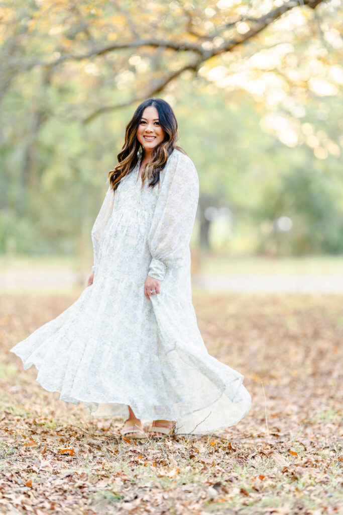
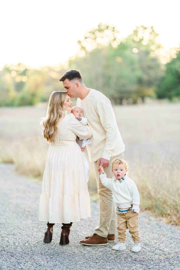
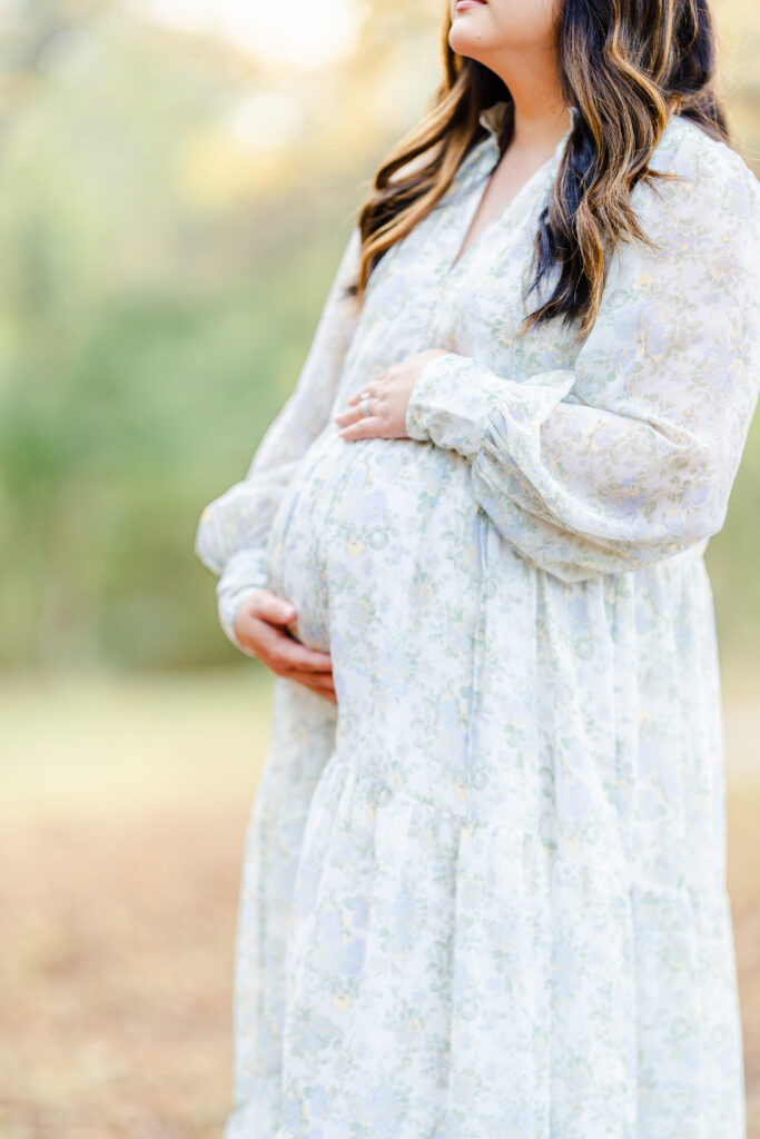
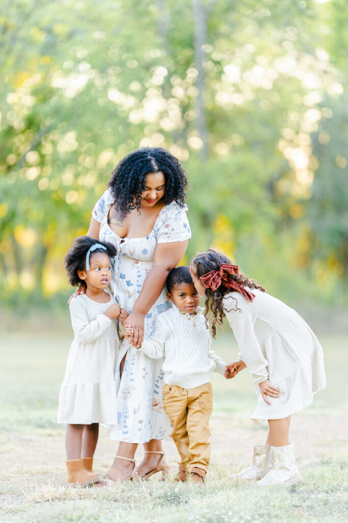
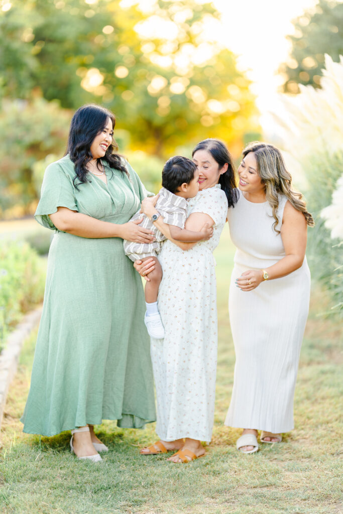
Neutrals are always a safe and stunning choice. Creams, soft whites, beiges, and gentle greys reflect natural light beautifully, creating a timeless and elevated feel that never goes out of style. These shades complement my signature light and airy photography style and allow your family’s connection and expressions to take center stage.
When planning your outdoor family session, especially here in McKinney or Dallas, the best colors to wear for outdoor photos are those that allow the natural environment and your family’s personality to shine without distraction. Neutral tones offer a classic, understated foundation that feels cohesive and organic in any season.
Adding Soft Colors for Depth
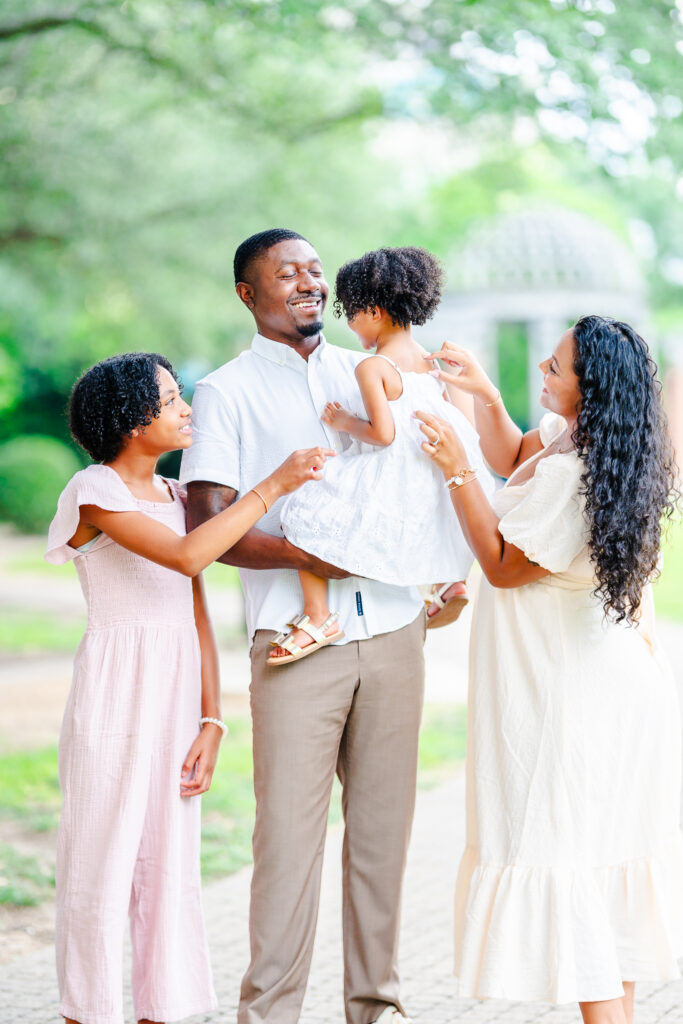
But neutrals don’t have to mean flat or boring. I love pairing them with soft colors. Think dusty rose, muted sage, soft peach, or sky blue. These gentle tones add depth and dimension without overwhelming the frame. When mixed and matched thoughtfully across coordinating family outfits, they create a rich, cohesive palette that feels both effortless and refined.
Seasonal Color Harmony for Outdoor Sessions
Another reason I favor neutrals and soft tones? They harmonize beautifully with the natural environment. Warmer neutrals—like tan, oatmeal, or soft caramel enhance the vibrant greens and golden hues of summer. Cooler tones such as pale lavender, powder blue, or misty green blend gracefully with the soft wildflowers and cooler undertones found in nature during spring or early fall.
During the fall and winter months, I often encourage a richer palette of texture and deeper hues soft knits, corduroy, or velvet in tones like rust, forest green, or deep navy. The backdrops shift to tall neutral grasses, crisp skies, and bare trees, so grounding these deeper colors with neutral layers keeps the images lifted with light, while introducing elegant contrast and seasonal richness.
Wearing colors that align with the season elevates your entire session and ensures the color harmony looks natural, not forced.
Colors to Avoid for Outdoor Family Photos
Some colors, however, can be distracting or even unflattering. Bright neon tones, stark blacks, or overly saturated colors can cast color onto your skin, weigh down the image, or clash with the soft outdoor backdrop. It’s best to steer clear of these for a timeless and polished result.
How to Use Prints and Patterns Thoughtfully
Prints can absolutely work but with intention. For smaller family groups (five or fewer), I recommend limiting prints to just one person to avoid visual competition. In larger groups, two subtle prints can work well if they’re complementary. The key is balance, letting prints add personality without overpowering the scene.
Coordinating Family Outfits Without Matching
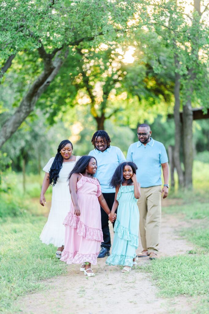
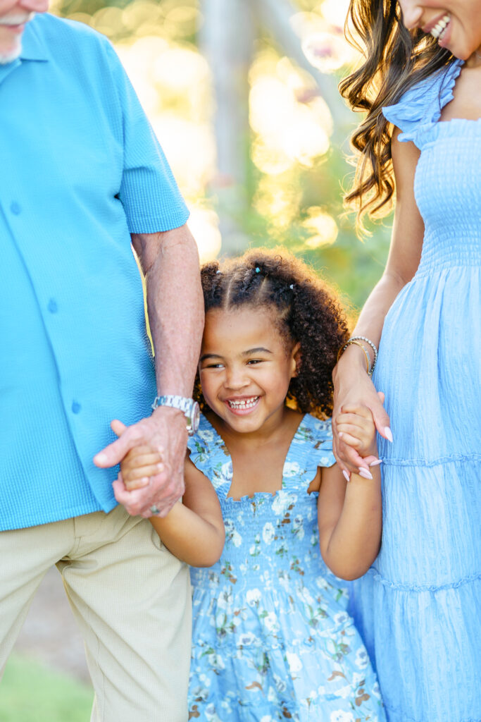
And remember, matching doesn’t mean identical. A monochromatic color scheme using different shades of the same color family (think dusty blue, soft navy, and pale slate) can look elevated and cohesive without appearing too matchy-matchy. Mixing and matching adds visual dimension to photos.
A Final Thought on Styling for Your McKinney or Dallas Family Session
Your family’s wardrobe should feel like an extension of your story – timelss, intentional, and reflective of the season. If you’re ever unsure, I’m here to help guide you through the process. As your trusted Dallas family photographer, I provide personalized wardrobe styling as part of every booked session to ensure you feel confident, comfortable, and beautifully styled.
Looking for more family photo outfit ideas or help coordinating your outdoor family photo color palette? Let’s create something beautiful together.


